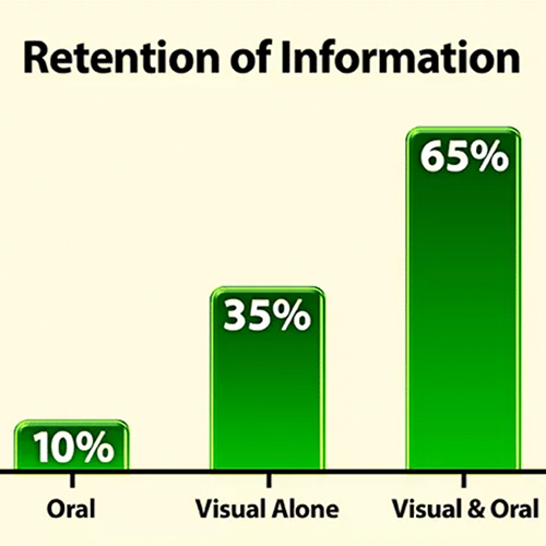
Research has shown that an excellent visual presentation can significantly improve the retention of information and ensure a far better experience for your audience if it is delivered well.
There are many different visual aids and software programmes that you can combine with your spoken presentation. You must choose the right ones for your audience. Audiences will respond differently to the various visual prompts in your slide deck or the physical aids you use to reinforce your message. However, it’s also essential you don’t use your visuals to hide from your audience.
Strange though it sounds given that you will likely be standing in front of an audience, people can, on occasions, use slides as protection. Some read directly from the slides, while others let the visual aids deliver much of the presentation when they are unsure of the topic or are unprepared.
Guy Kawasaki, a Silicon Valley investor, has a good approach to this. He advises entrepreneurs to follow the 10/20/30 rule when delivering investor presentations.
He believes there should be no more than ten slides, it shouldn’t take any longer than 20 minutes, and the font should be no smaller than 30pt. Although this may sound like a rigid guideline, his approach helps entrepreneurs to make sure the pitch isn’t all about the slide deck and offers a guideline to follow.
The slides you show, in whatever presentation software you use, are there to back up what you say, not to say it for you. So here is a rundown of dos and don’ts for your visual presentation, whether you are presenting to investors or inspiring your team.
Don’t Let The Slides Become The Show
You must lead your presentation. People have signed up on Eventbrite, agreed to listen to your elevator pitch or are heeding their leader’s call to attend because they want to hear what you have to say.
Visual aids have a huge potential to distract your audience, the moment you share your slides, you create a competition between the audience’s eyes and their ears…. And the eyes will always win.
If you let the content of the slides dominate the audience’s attention, they will miss the vital information you are delivering. It can be difficult to focus on more than one thing at a time, so if they are concentrating on reading what’s on the screen or are distracted by flashy animation, they are not listening to you.
So make sure it’s you delivering the key points and that people are not hanging on the information from the slide. Don’t find yourself in a position where you are competing with the slides; use them to reinforce your point, not make it.
Control the audience’s attention whilst you present your slides
Font size
Any slide you add to your deck should be easy to understand within a few seconds. As Guy Kawasaki suggests, the size of the font you use should be large and consistent. Don’t have the main points at size 30, subheadings at size 20 and additional points at 16pt. This suggests you are cramming in too much information. The audience at the back will be squinting to see and lose interest.
Images
Layering in lots of images, positioning them at different angles, adding fancy borders means they often become too small to be recognisable, and they don’t add anything to your presentation.
If you have graphs or infographics that pull together a range of facts and figures in a simple fashion, make sure the key stats stand out.
Animation
Animation can add some creative flair to your visual presentation but remember, the more time your audience focuses on the animation behind you, the less time they’re listening to you.
The added complication with animation is that you will likely have to control it manually or with a clicker. There is the option to set the timer to move the animation automatically, but if you get out of sync with your speech, it can add to the confusion and cause you to lose your train of thought.
Changing slides
While the presentation slides themselves can distract your audience, the process of changing the slides and introducing them to your audience can also cause them to lose their focus.
Introduce the slide with a strong remark that will lead the audience where you want them to go and then tell them what you want them to see. For instance, if you are about to display last year’s fantastic sales figures, then start with:
“In the last 12 months, we have experienced fantastic sales… the month I want you to focus on in this graph is…. “
Time to consume
Once the slide is up, give your audience time to consume the information. Remember, you don’t want to try and compete with the slide, so factor in a few seconds of silence to let them digest the information.
Then paraphrase around the slide if you need to, and replace it with a holding slide with your corporate background or logo. This will remove the temptation for the audience’s attention to wander back to the screen.

Using silence and managing the information displayed on the screen ensures you are in control of the presentation. It reduces the likelihood of competing sources of information and helps your audience get the most from the experience.
Visual Presentations Do Work
There is no doubt that a visual presentation will have a greater impact on your audience than simply delivering an oral address. However, you should never forget that any visuals you use are there to support you and that simplicity is always the key.